a work in progress // project history
design studio - branding & package design project
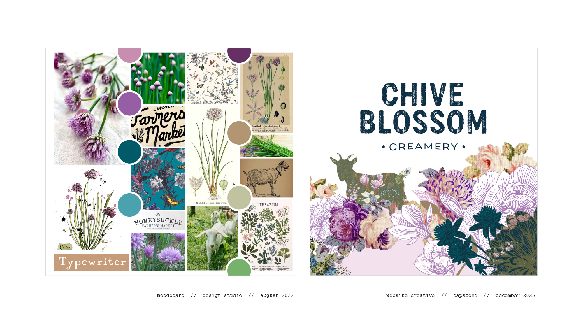
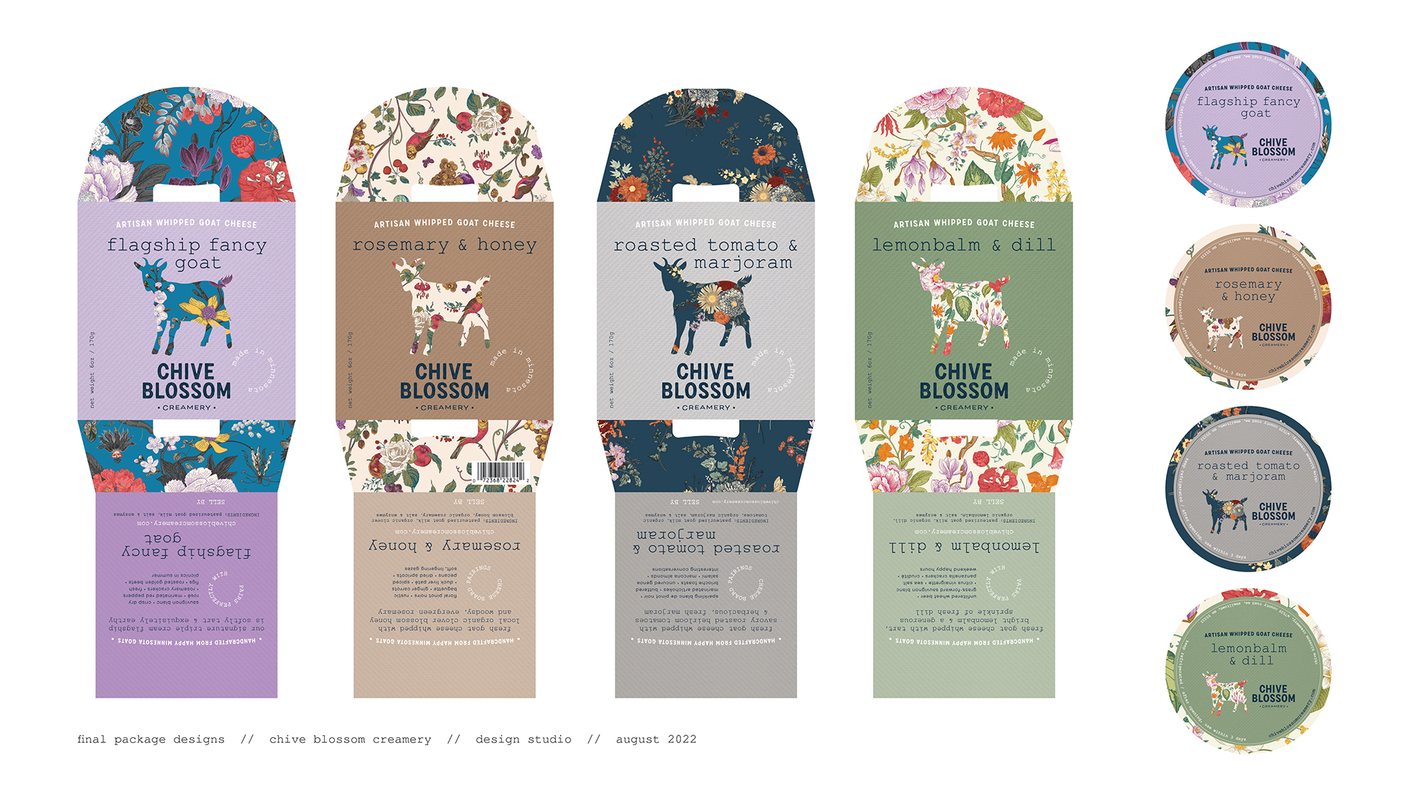
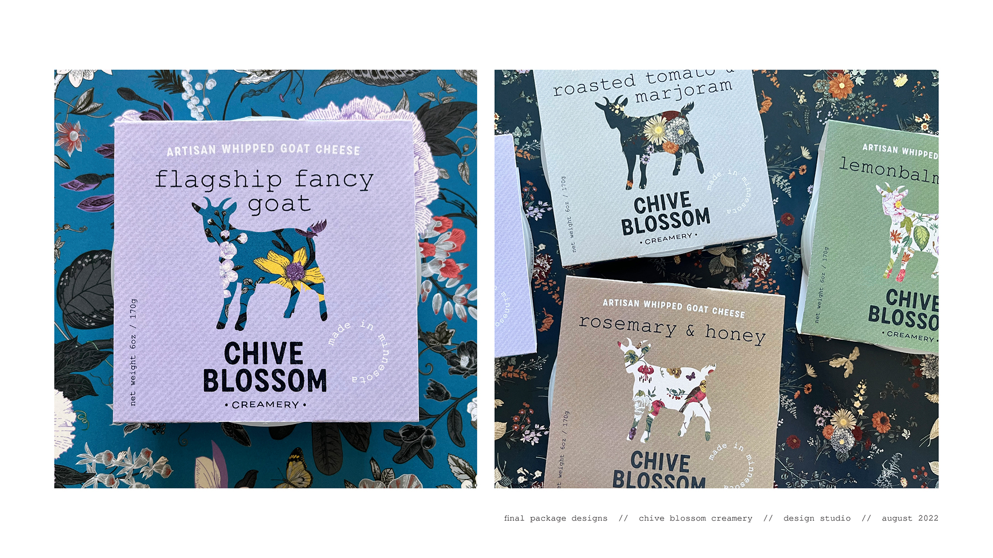
this capstone project started back in 2022 in the design studio course, with a brand identity & packaging focused studio project for my imagined goat cheese business. i created the initial branding & visual identity including the logo, color palette, typography, and curated imagery, patterns & illustration - and applied it to a boutique package design collection.
experimental interaction - brand refresh & exploration
i picked up the designs again after a year on the shelf for last semester's dynamic identities project, which was in the end essentially an incubator for refining multiple aspects of the visual identity. it's not every day that a designer can revisit concepts over multiple points in time, so this project work was a great opportunity to reflection my designs and refresh, refine, and integrate strategic improvements.
capstone project: process, resources, prototypes & expert feedback
finalizing the visual identity & developing creative for the website design for chive blossom creamery & farm
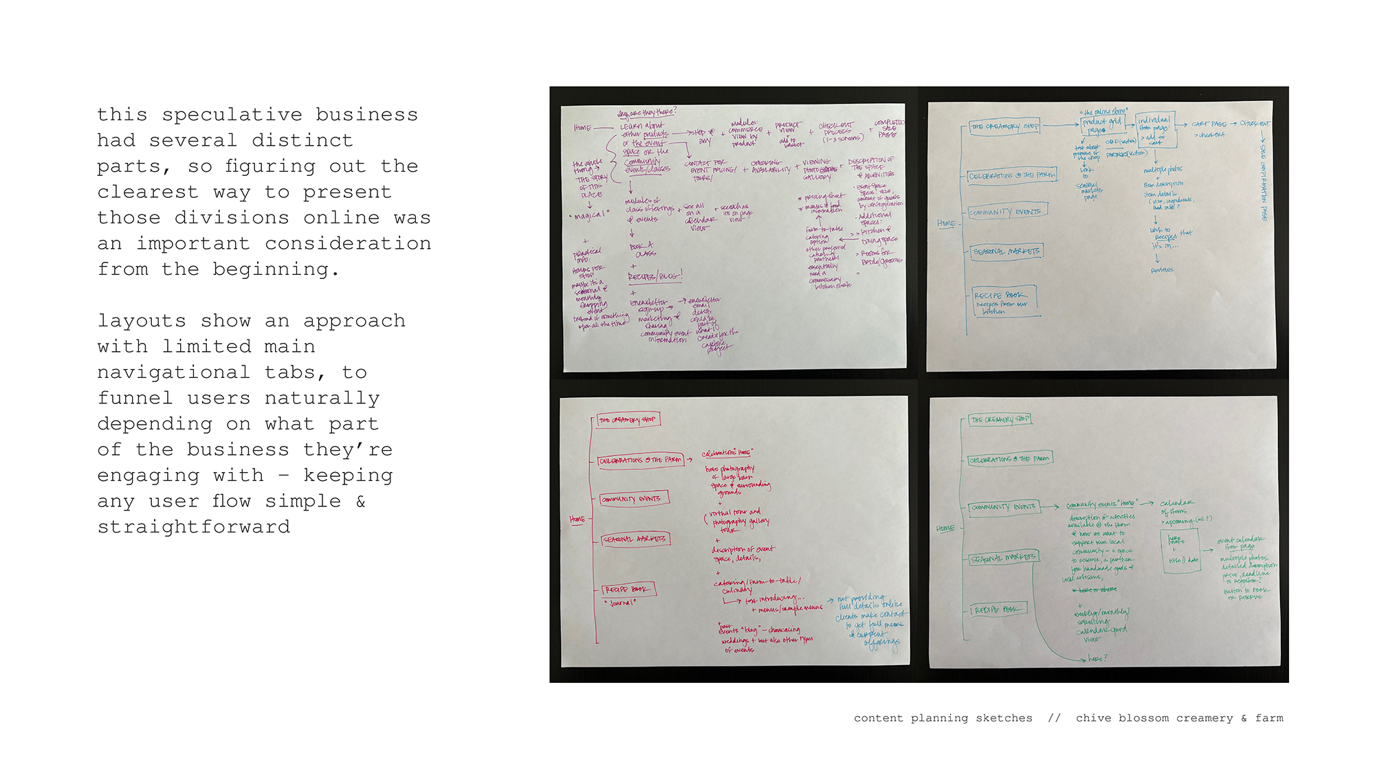
one last time to dive back into this long form design project! my capstone project focuses on creating website design boards for this imagined small artisan business - as it expands to include an event & wedding venue along with a community event space - and continues to refine towards the goal of a visual identity that communicates that this business is artisan, authentic, creative & community engaged.
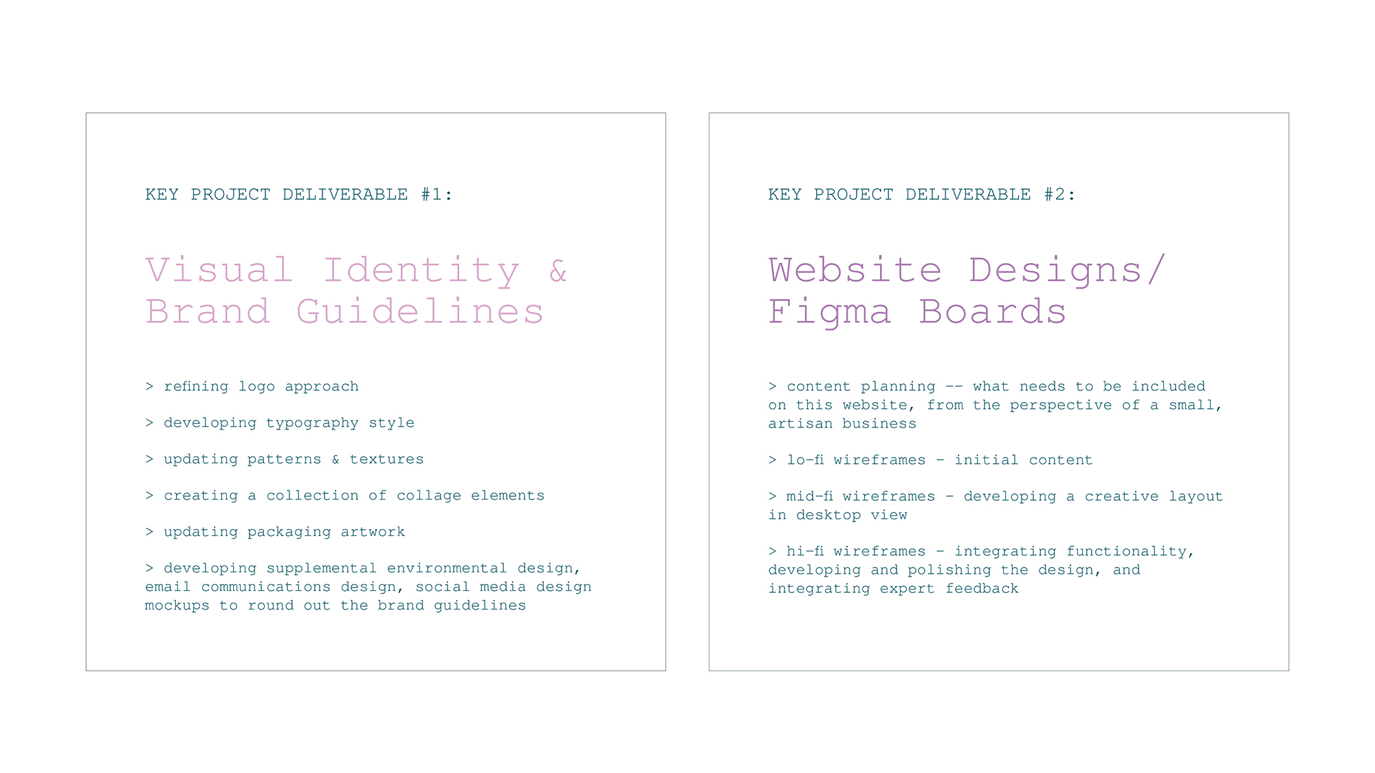
project deliverables
resources & research
i started with pulling together past work with initial research on inspiration for brand refinement and website design best practices -- for artisan maker-type businesses and also for events and wedding venues that are similar to my concept business.
additional research topics that informed this project included exploring the craft & independent makers industry more generally, gathering some general economic information about artisan businesses, and some info that touched on the psychological wellbeing of being creative and producing objects by hand.
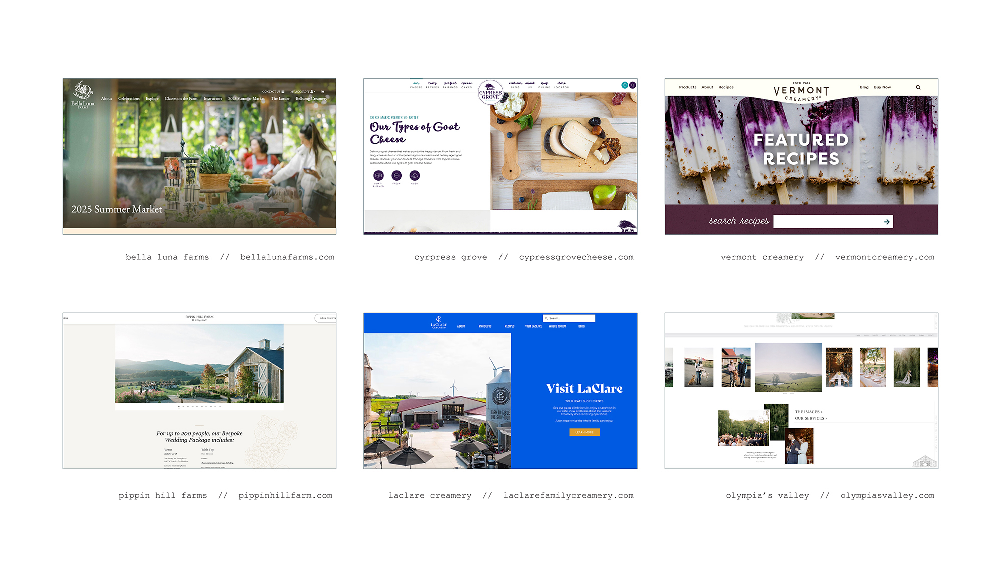
i was heavily inspired by a few wonderful examples out there: laclare creamery, vermont creamery, cypress grove for the goat cheese businesses, and pippin hill farm in virginia, olympia's valley organic farmstead & event venue in california, and bella luna farm in washington for the event venues.
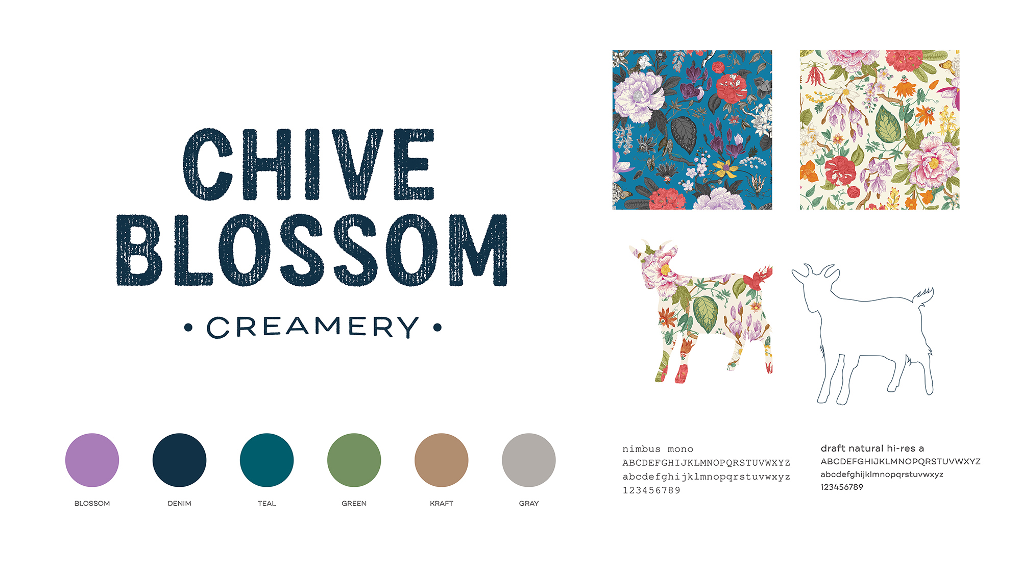
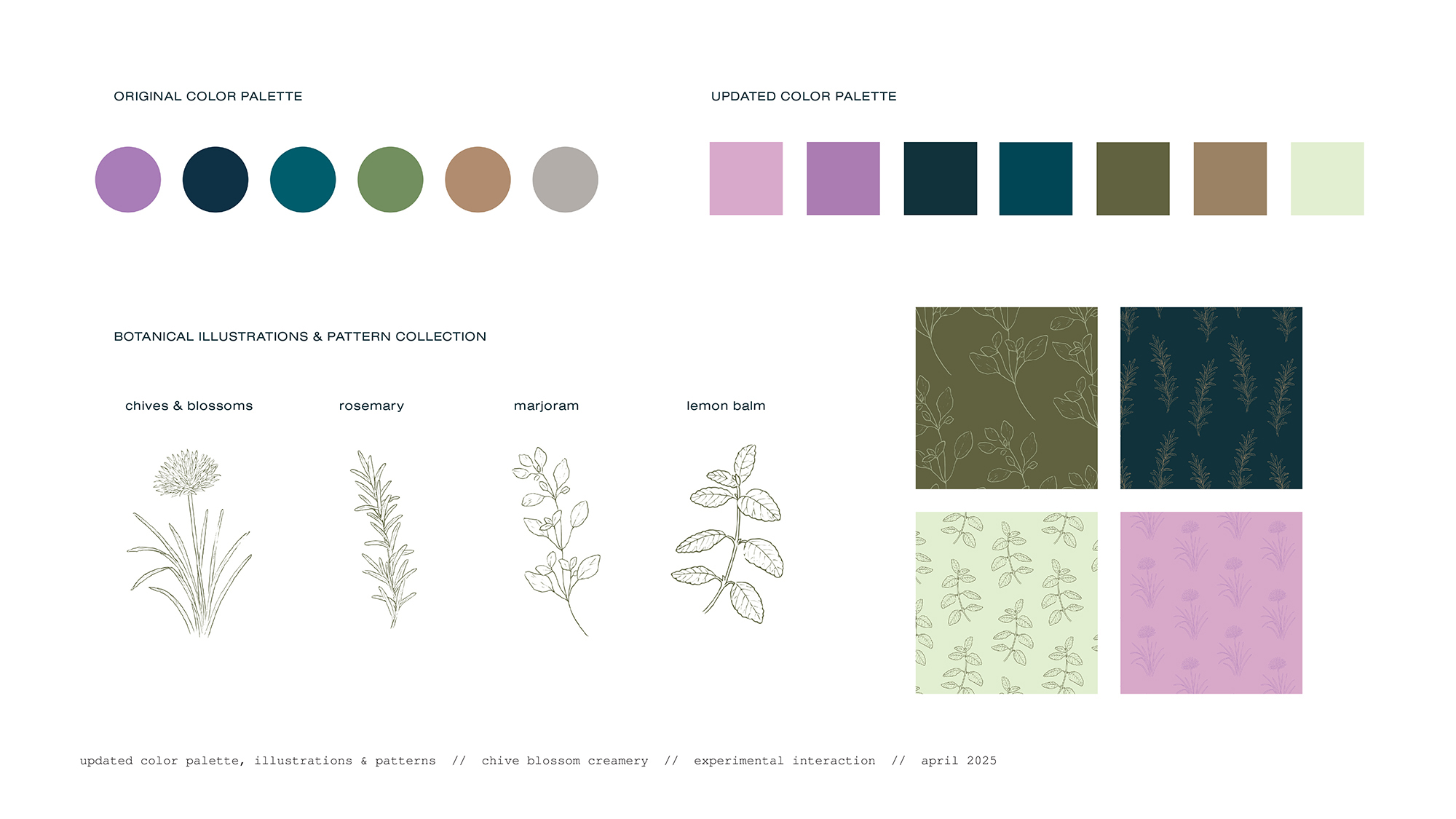
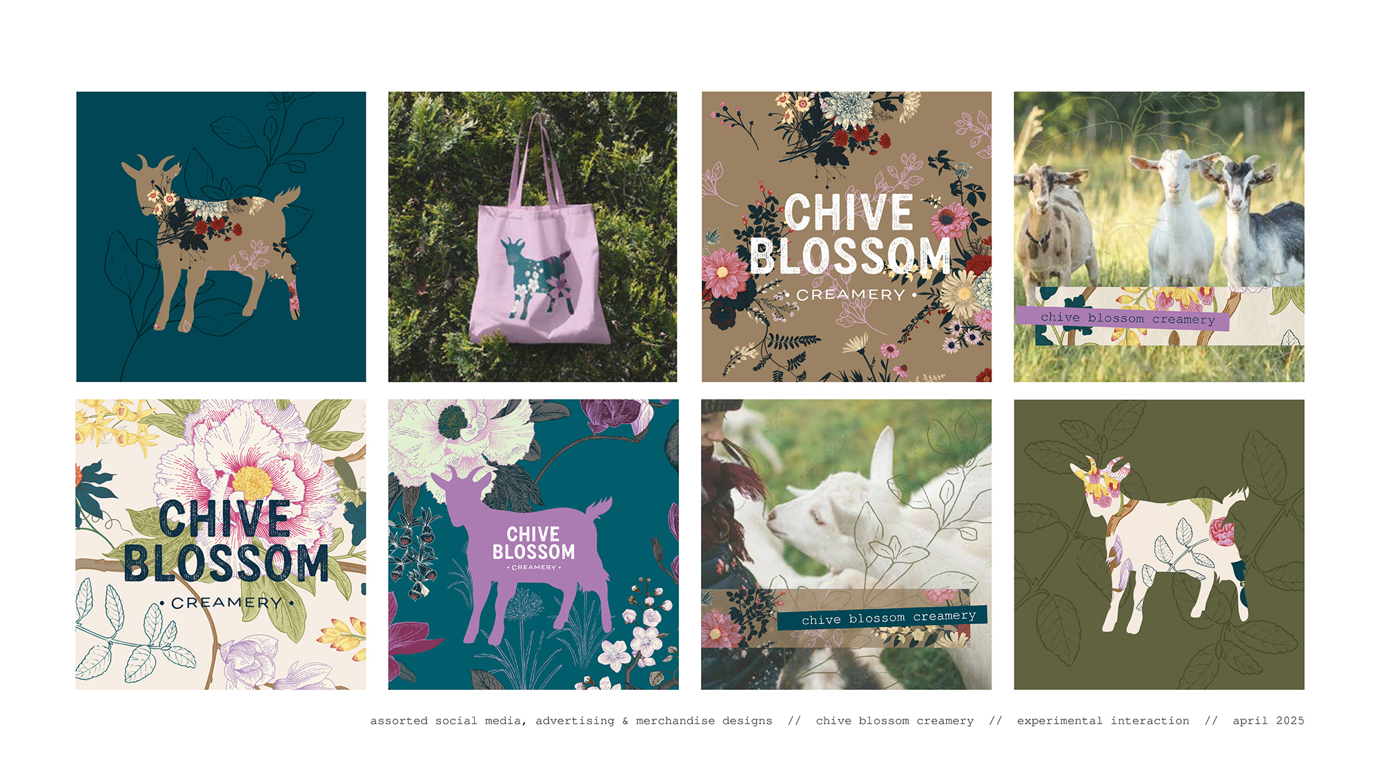
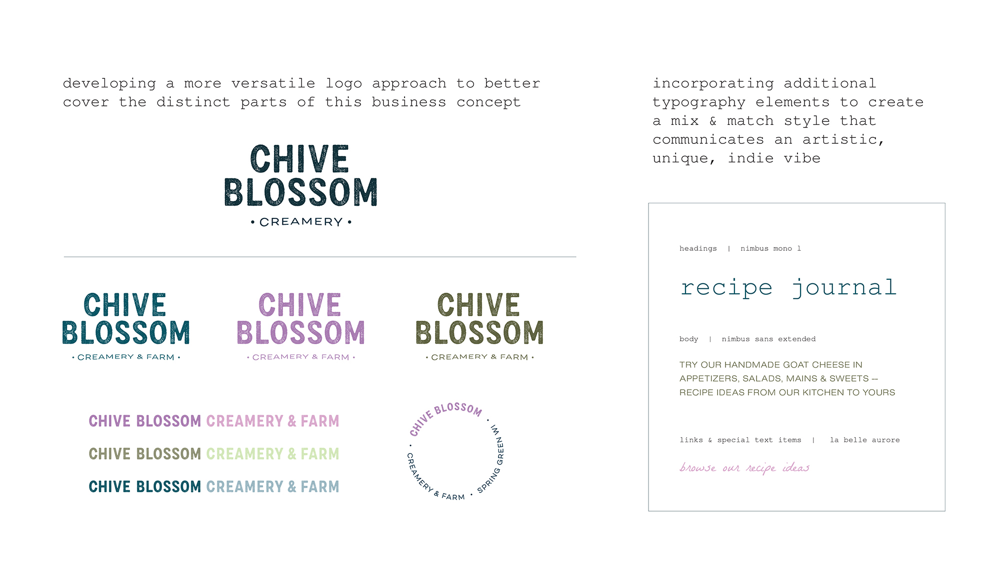
polishing & expanding the brand
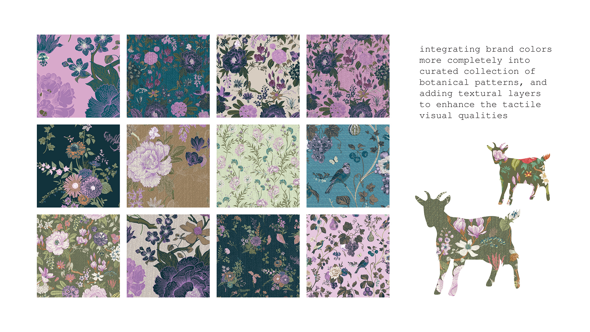
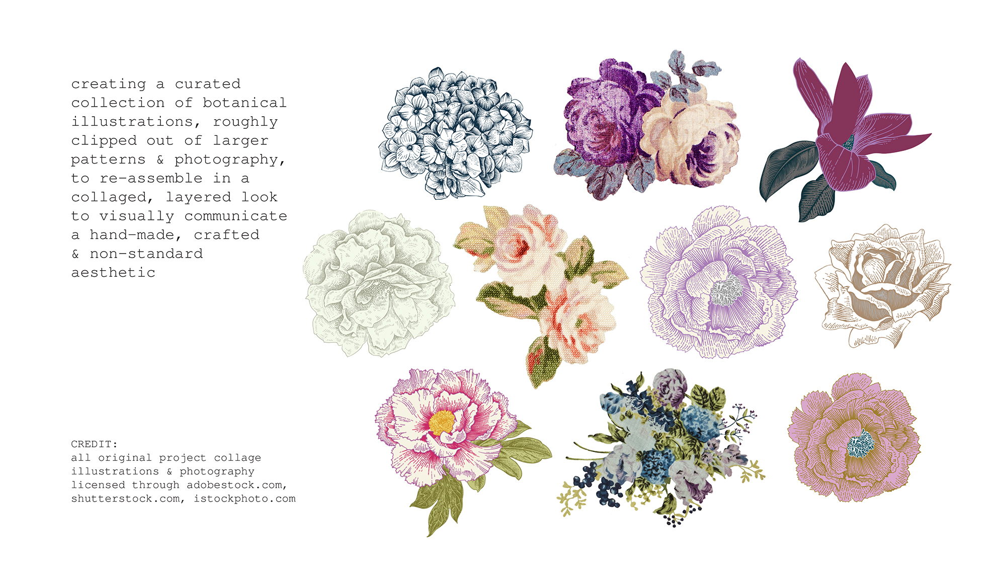
from logo versions, typography & color palette options, to graphic assets & illustrations needed to achieve a collage approach - refinements on all aspects of the brand elements fed into the website layouts as well as into supplemental pieces of collateral that would make sense for this business - signage design for farmer's market or pop-up, email newsletters for marketing communication and for building & engaging supporters and the wider community.
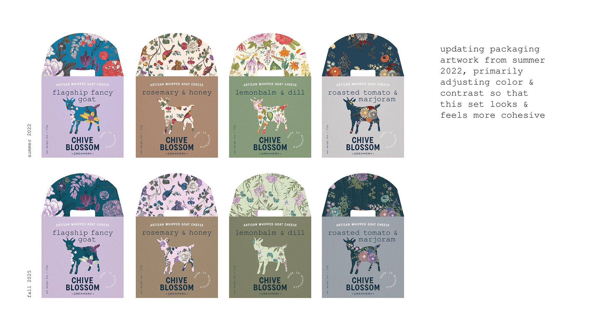
updated branding also meant re-visiting my package designs from a couple years ago and making updates, as well as adding a set of “label-style” design for a secondary product line.
prototypes & web design progress
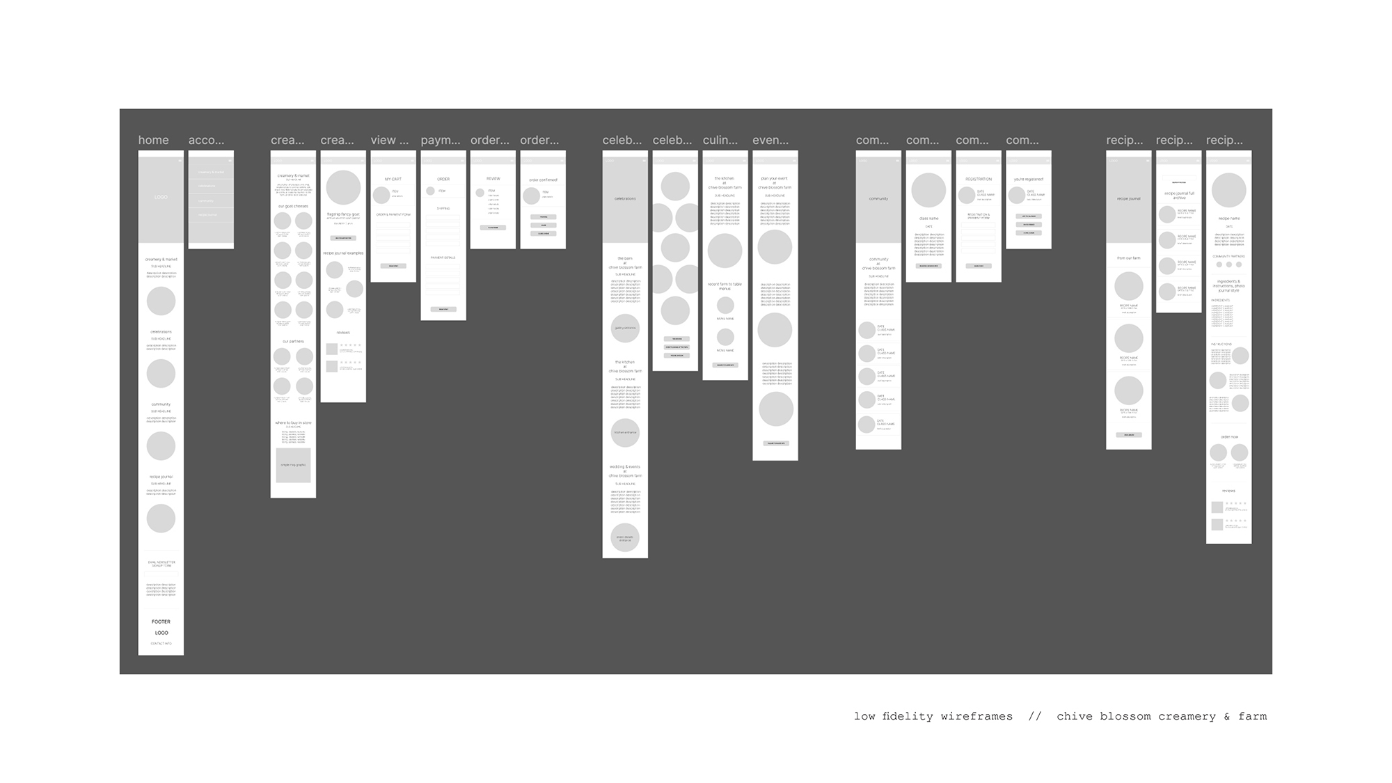
content planning, prototypes in low, medium and finally high resolution followed for the website designs, utilizing figma to build out my layouts and interactions.
the design process started with lo-fi wireframes in a mobile view - sorting out the basic areas of content for this site to cover all the aspects of the business in a simple layout.
from there, i pivoted to planning, iterating & experimenting with layout and content organization in a desktop view in figma, and continued to build out the key pages for design that cover the key functionality to make the site successful.
project advisors & expert feedback
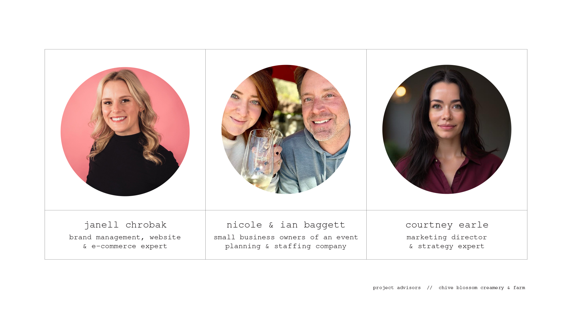
project advisor: janell chrobak, brand management, web design & e-commerce expert
questions & considerations
in preparation for my meetings with my primary project advisor janell, some of the questions I jotted down for our conversations included:
- thinking about a very small start-up kind of business, for an artisan maker - how would you guide them to think about building a brand identity and their website?
- what key components would you present to such a client if you were working on helping them with their brand identity?
- what kinds of things come to your mind thinking about “makers” as a business?
- for the website, what are some best practices to consider for addressing user experience related to e-commerce?
- what should i keep in mind about the creamery & market sales page? any tips for how to best present the items themselves? for their individual item pages? what would be smart to include to promote sales once people are on the website?
key takeaways from our conversation // tuesday, september 30, 2025 // 5-6:15pm
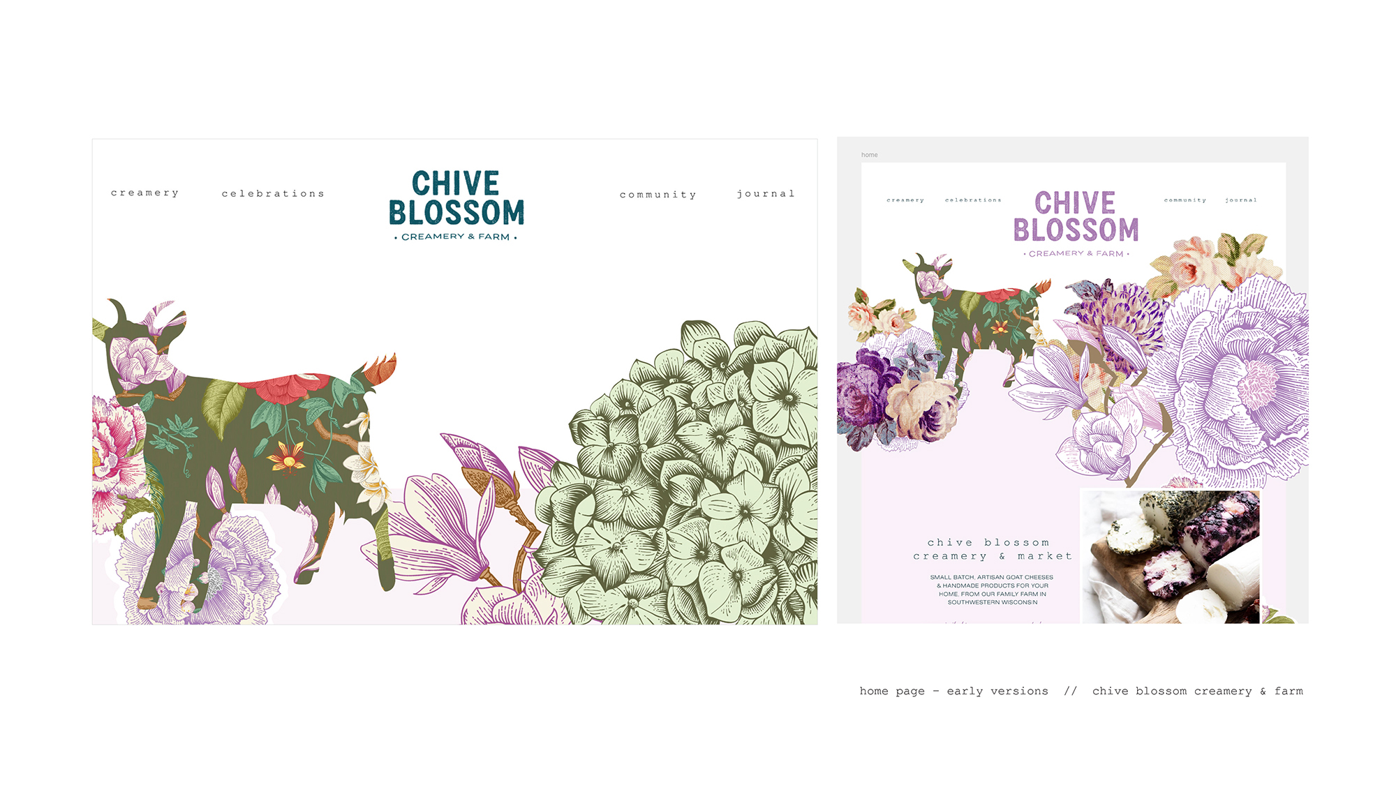
janell preferred the original logo and the text sizes, and she made the point that this business has a lot going on with it, and it might be better strategically for the business as well as for the visuals of the logo to have “sister” logos and separate the creamery part from the event part. the creamery logo could be used exclusively for products, and the other companion logo would be used to promote the weddings/celebrations and community event space part of the business. i would still need to come up with the exact wording, but i'm leaning towards exploring this direction of sister logos. she liked the chive blossom text element of the logo and said it fit my imagined artisan business well. she also noted that the texture and contrast are going to work well for accessibility both in the denim blue as well as reversed out into white (and the texture color coming through from behind).
for a real-world approach for creating and executing a website for a small business, she would be looking to work with a designer to come up with the art direction in software like figma, and then source the web development to a specialized company to actually code the site. however, for a smaller, scrappy business, she's seen it work well for a designer to find one or two key templates on a platform like shopify or wordpress and then become an expert in how to manipulate that template for multiple different client needs/projects. she added the point that a highly customized website isn't what most smaller scale businesses are looking for, because they typically want to skip the heavy development and be able to easily edit things into the future. as she said, “i don't want to need a dev.”
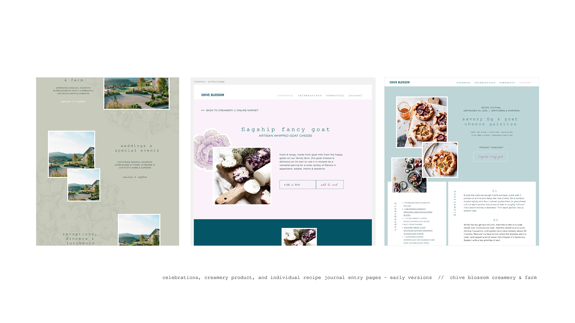
a few final key takeaways: we discussed the visual idea of having the landing of the website be a full-screen experience, and she suggested that i considered removing the “partners” section from the online shop page - it would likely be too cluttered or confusing for users.
key takeaways from our second conversation // monday, october 27, 2025 // 6-7:30pm
janell noted that my homepage design delivered a sense of the brand “right out of the gate”, with the decision to land the user on a brand artwork composition. she thought that this approach could work well for a client like this that has multiple parts to the business, as a way to cover a variety of functions without focusing more on one than another. she commented that my 4 main sections, corresponding with my 4 main navigation tabs, with the color coordination on them - helped to keep it simple and punchy on the homepage, a good first experience for the website user. she recommended adjusting the background color in the celebrations section for better accessibility.
we spend a good amount of time talking about my creamery market item page - in her work, she refers to this particular page as a “pdp” - product description page. she said that this page is one of the most important pages of a website that has a goal to sell items online - it's like a vip on any e-commerce website. she suggested adding a reviews section on this board, but noted that most companies will integrate a plug-in like judge me to provide the back end functionality required for a robust review platform. reviews are a big part of a successful e-comm page because users typically love seeing and reading them in a shopping context. janell also recommended mocking up a -drop-down function to show a spot fo product specs like ingredients, size of package, etc, underneath the descriptions.
related to the pdp on my website, she suggested that it could be beneficial to have a “collection” page - all the whipped cheeses, all the hard cheeses - on a landing page - so that when marketed online, there is a unique url to direct traffic to related to a featured type of product (that has multiple flavors, for example).
for the community page and the recipe journal page - she noted that these type of “blog” page set-ups work well for client updates because each item that is added will have its own unique url for marketing purposes, and the landing page serves as a tidy collection page.
project advisors: nicole & ian baggett, small business owners of an event planning & staffing company
questions & considerations
in preparation for my meeting with my small business expert advisors nicole and ian, some of the questions I jotted down for our conversation included:
- what are your overall impressions of the visual identity? logo? colors?
- what elements are doing the best job in communicating concepts like: whimsy, hand-crafted, artistic? are there any areas you feel are missing that vibe?
- do you think a section in the brand guidelines for social media related graphics would be critical for a small business in this space to have? how extensive should it be? would it need to be “phase 1” or could it come later?
- are there merchandise mock ups that would feel useful to include? are there other types of collateral that you'd want to see included in a brand / identity contract with a designer?
- as small business owners, what would your priorities for a visual identity design if you were engaging with a designer? what things would be top of mind for your business and on your wish list for designed assets?
- what elements are missing? are there other pages or things that as a client, you'd really want to see included in a set of website mockups / creative?
- what do you currently use for a website? how important is ease of updating / managing content yourself for how you set up your website?
- how do you drive traffic to your website? what are your key tactics for building awareness and clientele, and keeping your audience engaged?
- do you use an email newsletter / email marketing as part of your marketing strategy?
key takeaways from our conversation // friday, november 7, 2025 // 10:30am
nicole thought that the aesthetic look of the brand guidelines and website fit the demographic of people that would be my natural audience - the same clients who are looking to buy artisan goat cheese are also the type of consumer who might potentially want to have a rustic barn wedding and participate in community-based events.
both nicole and ian commented on the cross-linking between sections like the journal and product pages as good for keeping visitors on the site for longer. nicole commented that the organization and division of the parts of the business were clear which is what she would be looking for with a business like this that has several distinct parts to it.
ian asked if i had thought about including any supporting information regarding how this product would be shipped - would i specify if it's packaged in dry ice? the cost of shipping that way could be potentially mean that orders needed to be a certain size in terms of dollars to justify that extra shipping cost. that launched into a deeper discussion of exactly how would the sales for this business work, and maybe there is a different way to think about how to target sales that matched up with the other qualities of the brand: namely, local, human to human commerce interaction, community-minded, and artisanal.
in addition to minimum-quantity delivery options for a wider geographic area, this business could focus on pre-orders, where consumers could order their items ahead and pick them up at pop-ups and markets within the local community. they shared an example of a company that they shop with in this way - mogi bagels - and you pre-order your bagels and get to pick them up at places / events in the local community. nicole mentioned that in this way also, there is room for engaging in collaborations with other makers, places like craft breweries and wineries, liquor stores, farmer's markets, even craft fairs.
ian shared about how they have moved their social media activities from a wider target audience of the more general public to focusing on b2b as their better niche for events - that way they are making connections with other larger groups rather than clients who aren't looking for the higher price tag for the more custom and comprehensive services that their company offers. nicole shared that she thought it would be a smart plan to have two instagram accounts - one for the products and the sale of products, and another one specifically targeting the events and wedding space of consumers, but then taking advantages of opportunities to cross-market between those audiences on occasion.
project advisor: courtney earle, marketing director & strategy expert
questions & considerations
in preparation for my meeting with my marketing & strategy expert advisor courtney, some of the questions I jotted down for our conversation included:
- are the elements communicating: whimsy, artisan, creative, independent?
- how do you feel about the multi-colored logo options approach? as a marketing director, have you seen that approach work well, or are there pitfalls?
- as a brand identity - what positives do you see? what potential challenges do you see?
- if you were working with a designer on a brand contract like this, what deliverables would you feel are just essential for how you'd then market the company?
- are there any additions to the home page that you'd want to see?
- how important is generating an email client list for a business like this - to reach their marketing goals? do you have suggestions for how to entice people to sign up or for how to draw attention to that function?
- if you were asking for website design mock ups, would you want / expect email templates to also be included?
- for this type of artisan brand, with a business that has multiple business parts - how is this website structure working? are there pages to add to help create a fuller picture that a client would want?
key takeaways from our conversation // friday, november 7, 2025 // 4-5pm
courtney's overall impression of the brand guidelines, visual identity and website was that it was rustic and community-centric. she recommended the grocer's table as a business and website that i might look to for inspiration, they are community-oriented, have a retail grocery part of the business along with a café and wine bar, they share family recipes, and provide that simple quality, farm-to-table and curated experience. the sister business of the grocer's table is eloise, and she suggested i look into their use of pattern in their style.
she thought it could be beneficial to add some environmental design to round out the brand guidelines applications section - importantly, a brand tone section where i could refine some of the language about the heart of the business around sustainability. she suggested some phrases like “down to earth”, “poetic”, and “crafted by hand” among others. overall, she would want to see more about this business's approach to local sourcing and similar qualities to point the brand's authenticity and purpose.
she recommended that I add a section to the brand guidelines that includes voice and messaging to inform the newsletter and other important areas of content and verbiage. she shared a description of possible tone as down-to-earth, knowledgeable, and poetic, like a friend who knows food and nature deeply, and some key phrases such as “gather, taste, and slow down” and “crafted by hand, guided by nature”.