visual identity & brand guidelines
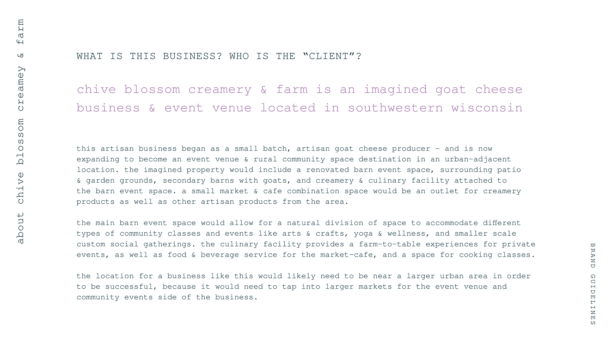
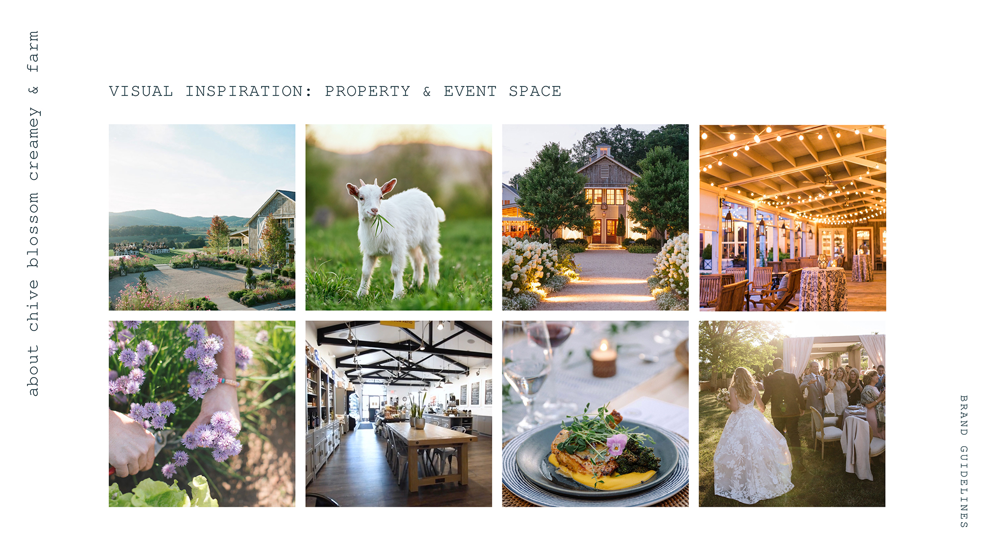
about chive blossom creamery & farm
an early step in my process was to flush out a richer description of my imagined client, so that i could better provide designs that would be tailored to their identity & goals.
brand concept
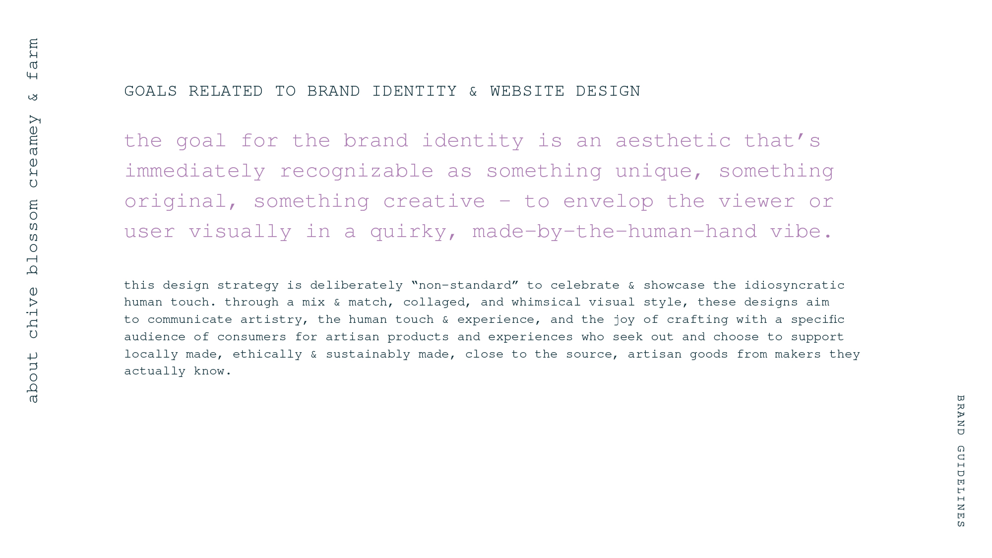
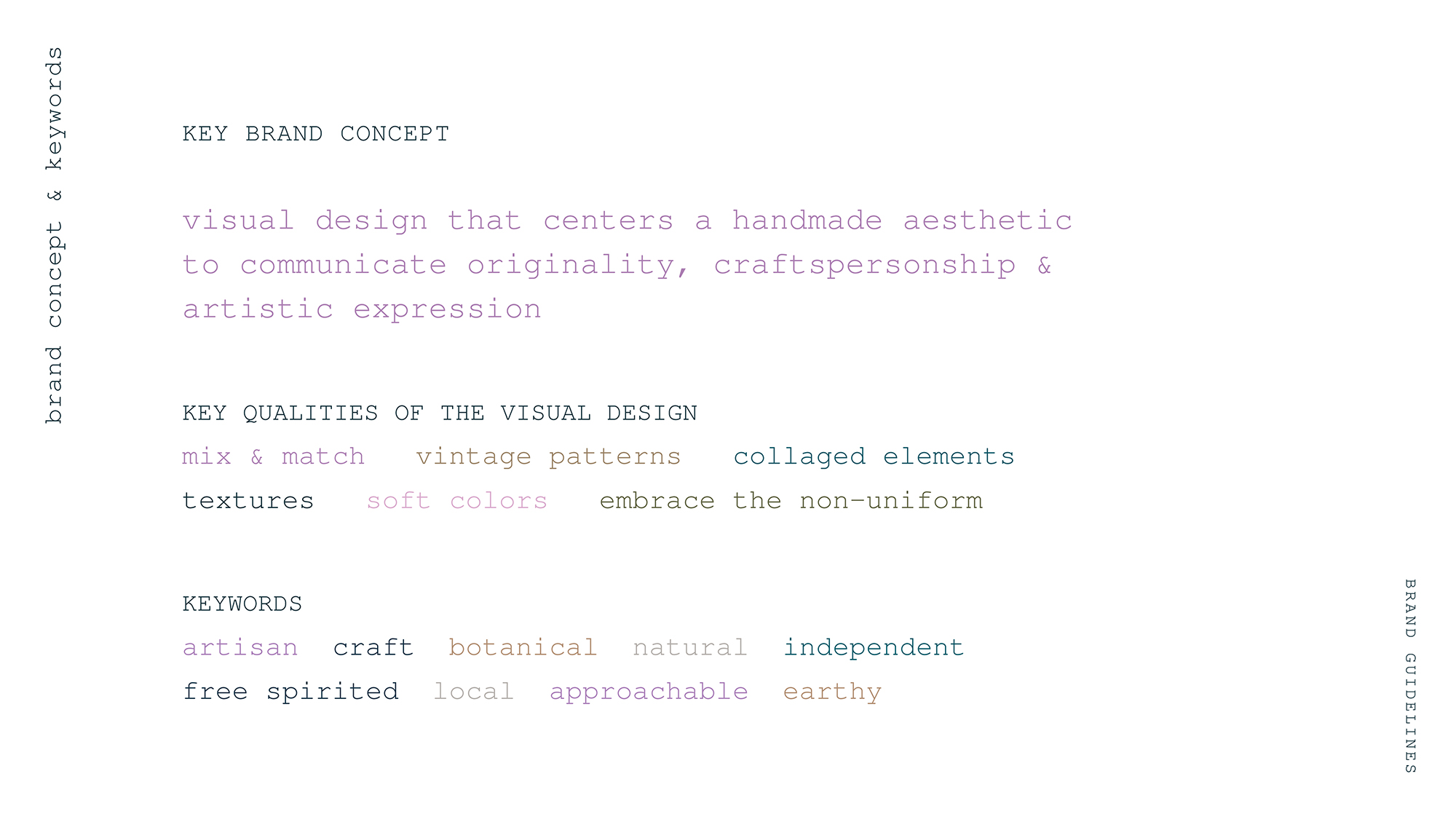
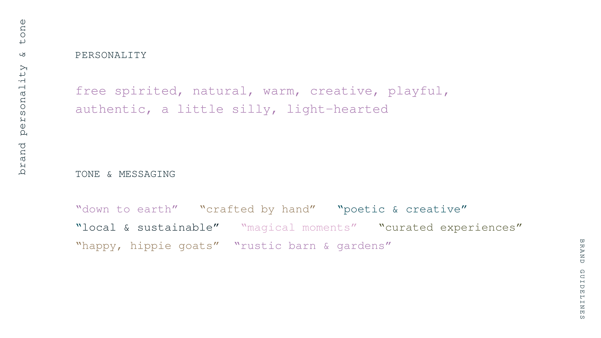
my approach for this client was to create a visual design that centers a handmade aesthetic in order to communicate originality, craftsperson-ship & artistic expression - qualities that align with the products and the company itself. Feedback i received in the process led me to add this simple brand personality & messaging component to the brand guidelines to make them more comprehensive for the client.
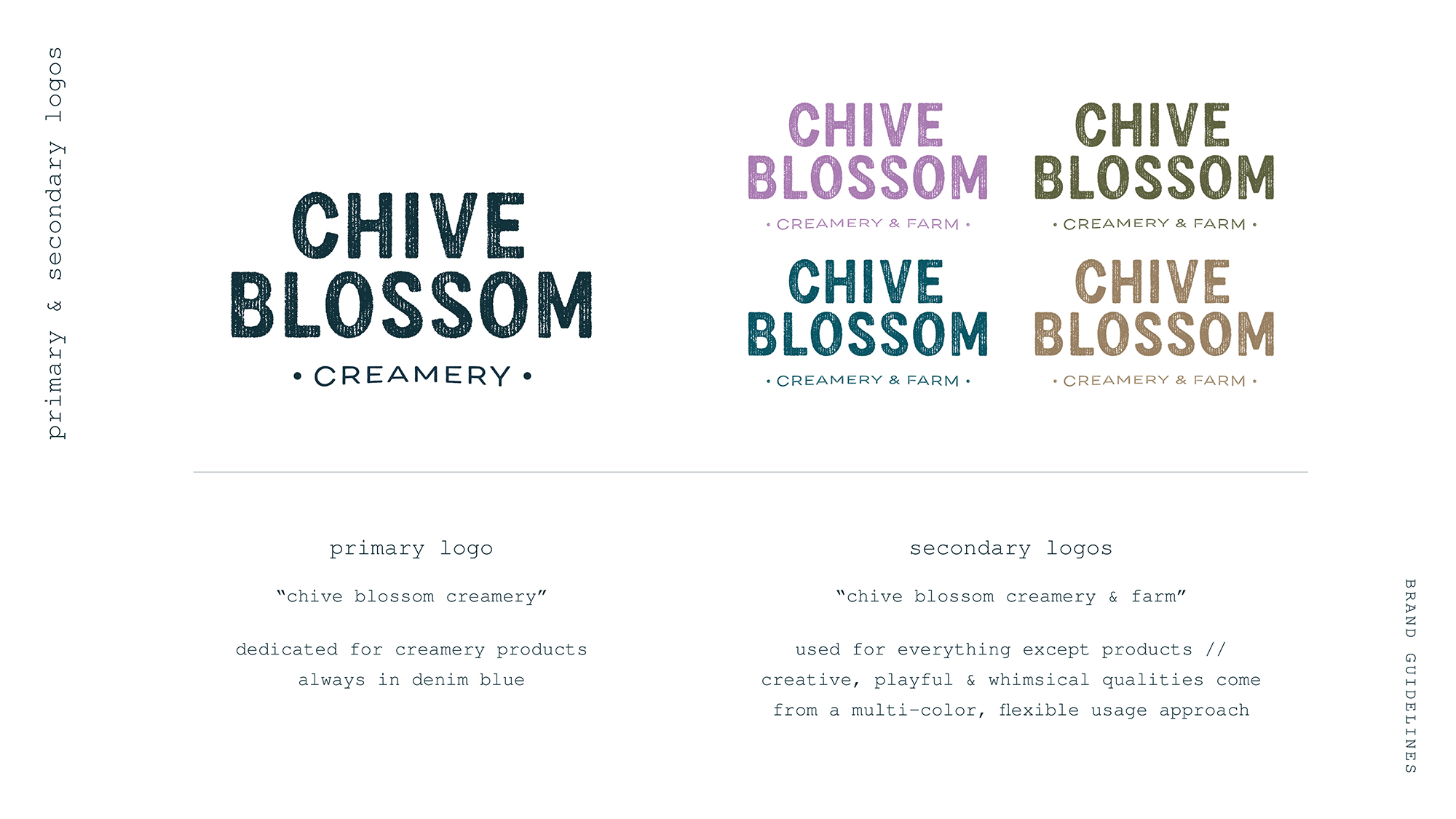
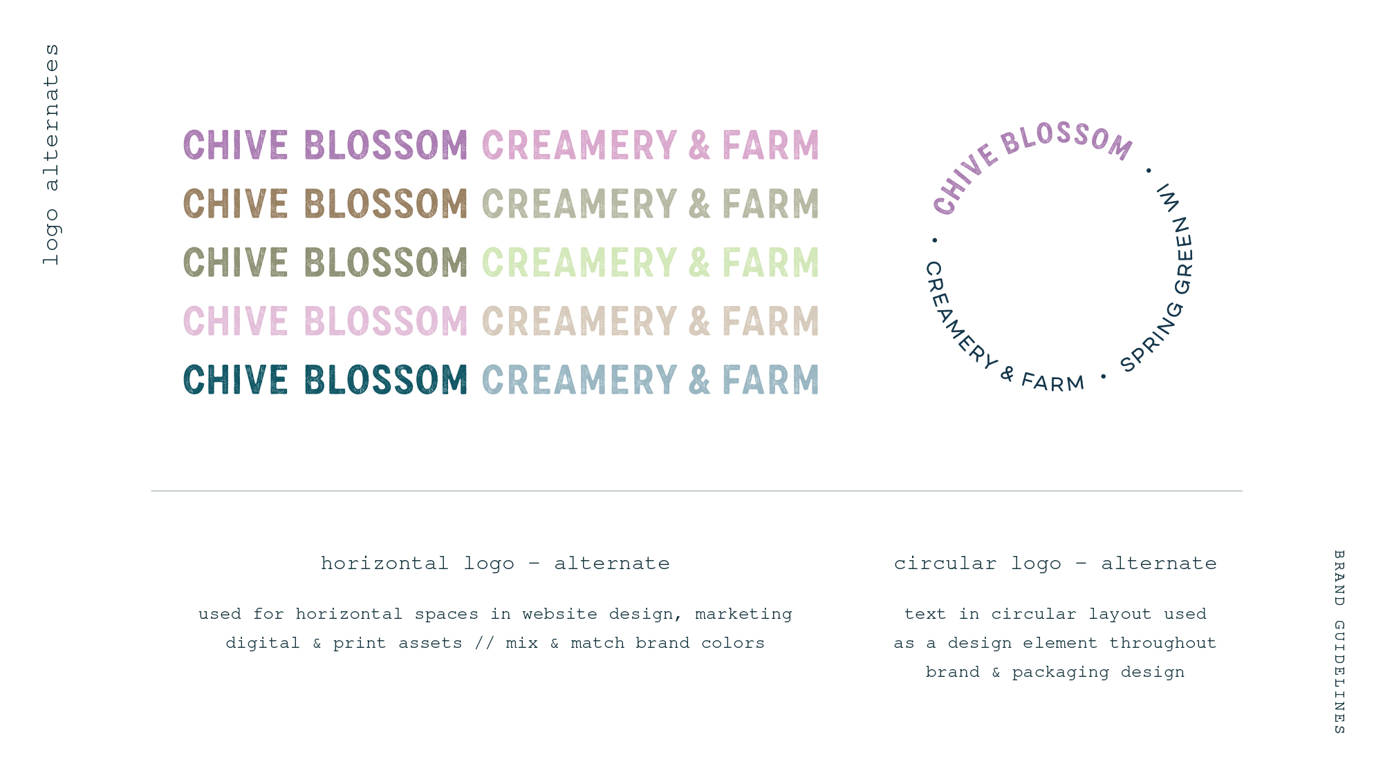
logo & alternates
i decided to use a set of “sister” logos for this brand based on feedback as well - because the parts of the business are so different, this approach allowed me to divide the product side from the events and generally marketing side. A stable, consistent logo for products, and a much more whimsical, mix & match approach for logo versions and usage for everything that's part of the farm experience. alternate versions are meant to be creative, free-spirited and variable.
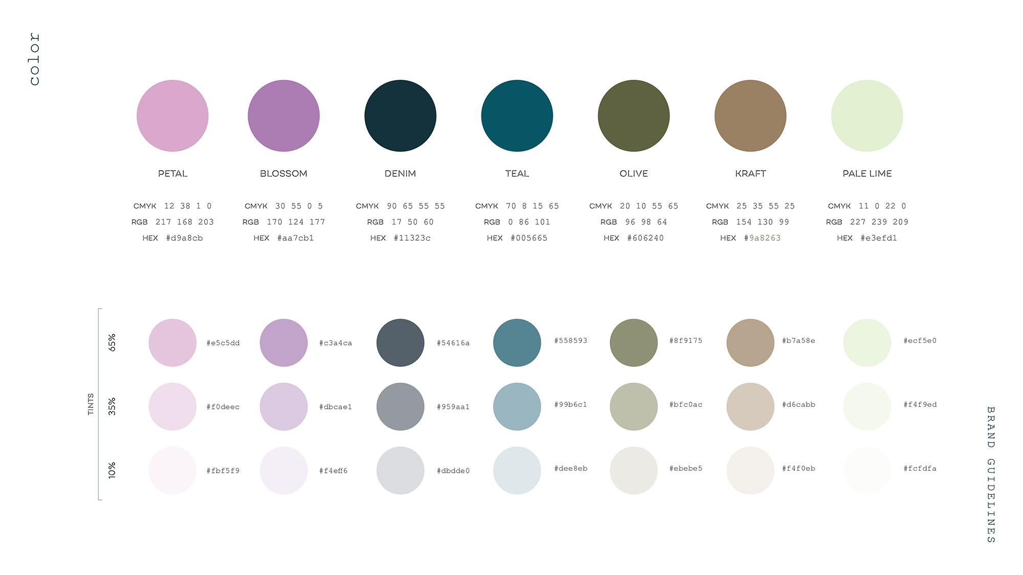
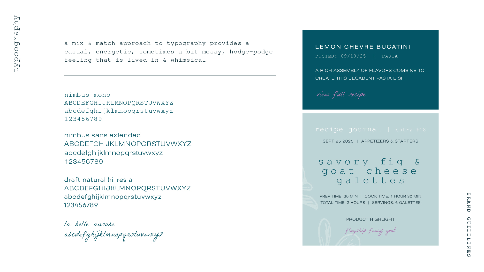
color & typography
color palette is included, along with set tints for use in creating contrast, especially online. updated typography provides stylistically diverse by playfully complimentary fonts to communicate an eclectic vibe.
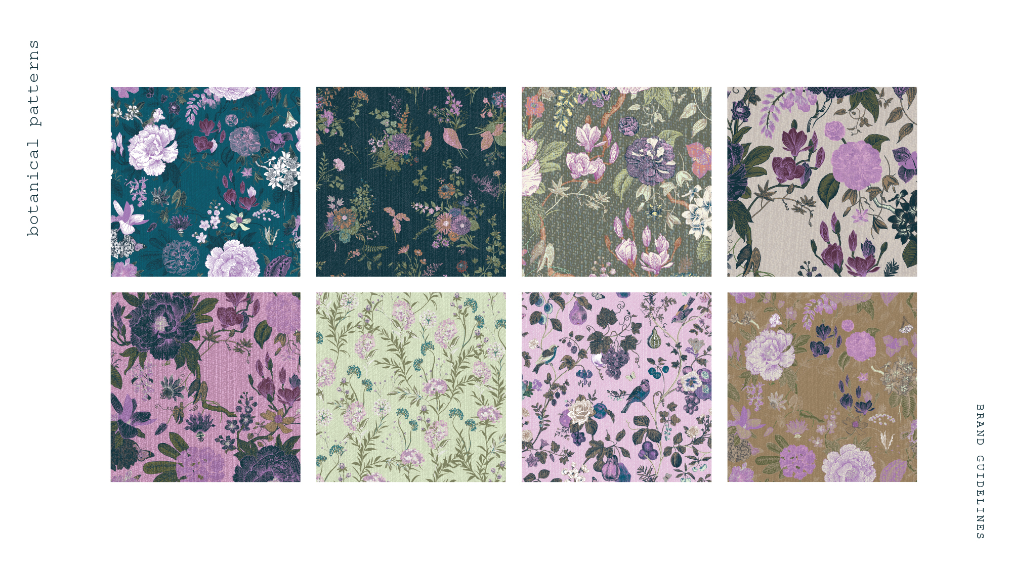
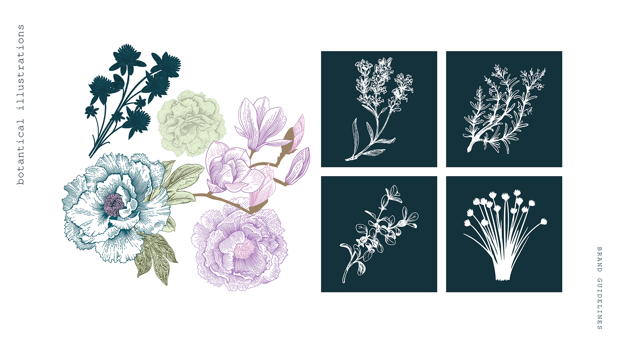
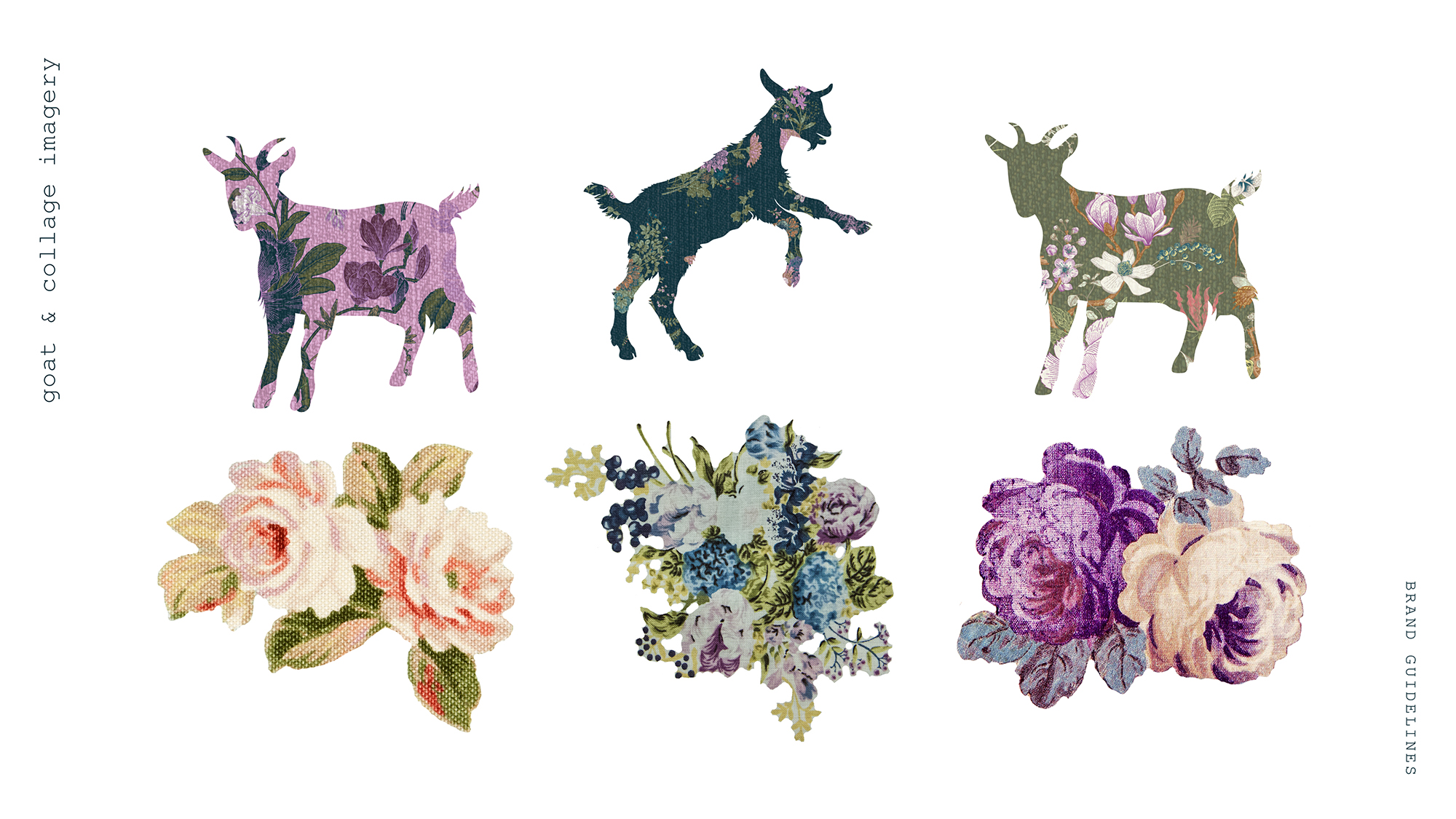
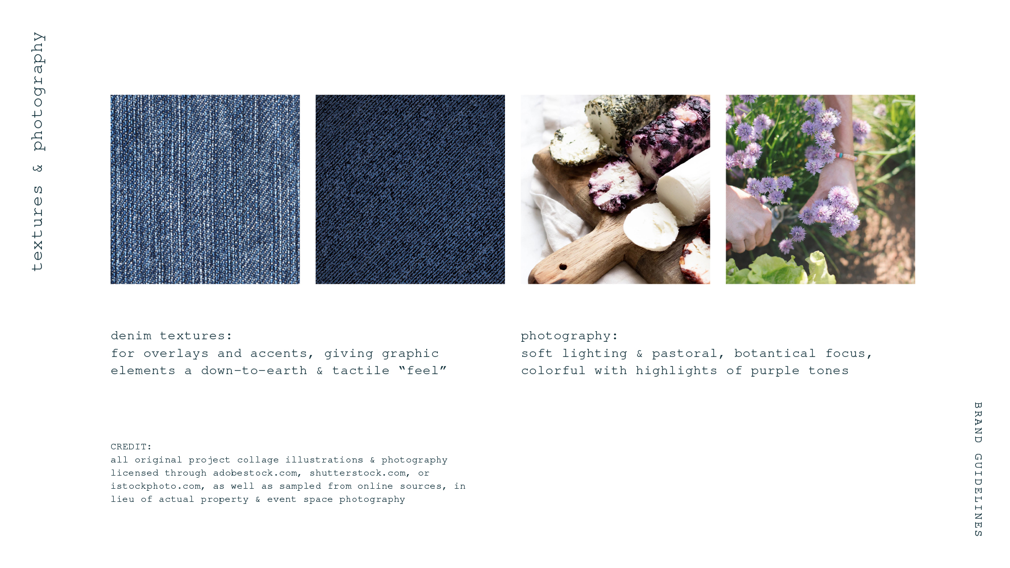
illustrations, patterns & imagery
all curated and customized pattern illustrations pull in the brand colors more substantially, and textural layers have been added to create a tactile, touched by hand visual feel. assorted botanical illustrations reference the property's gardens and herbaceous qualities of the products themselves. i pulled together a collection of collage elements to use across my designs, including floral elements clipped out of photography of vintage pattern fabrics. the guidelines pull in textures like denim for a down-to-earth feel, and photography that is soft and botanically focused.
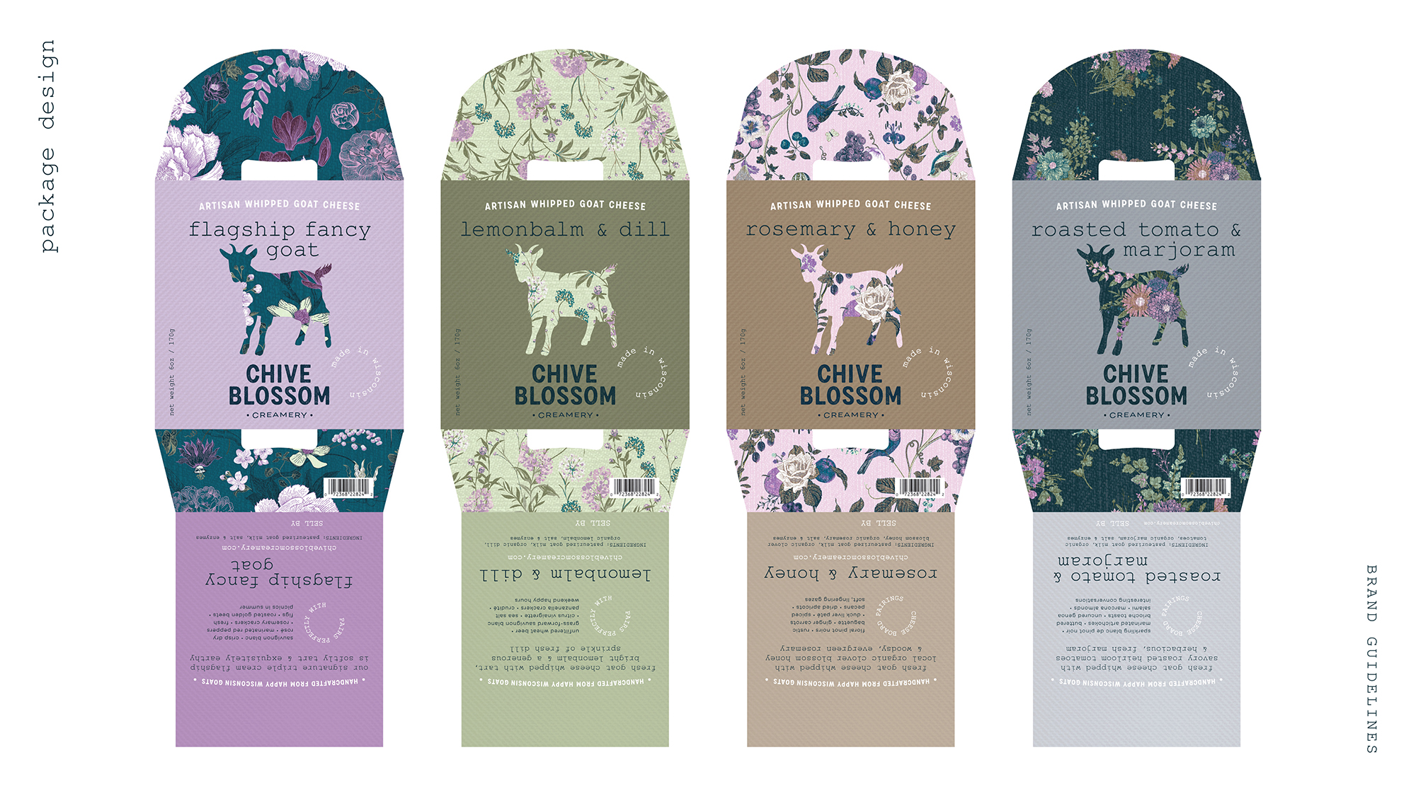
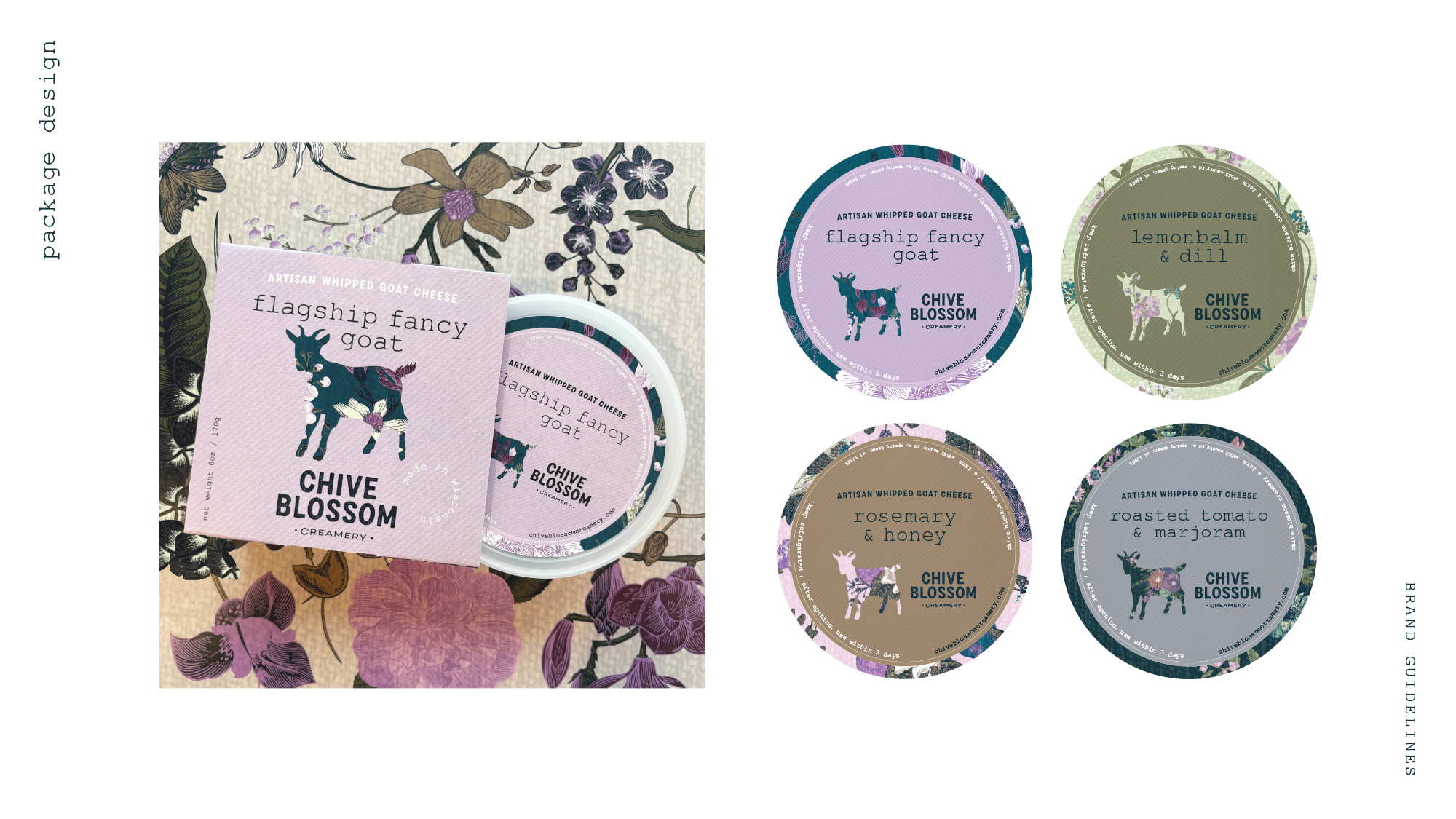
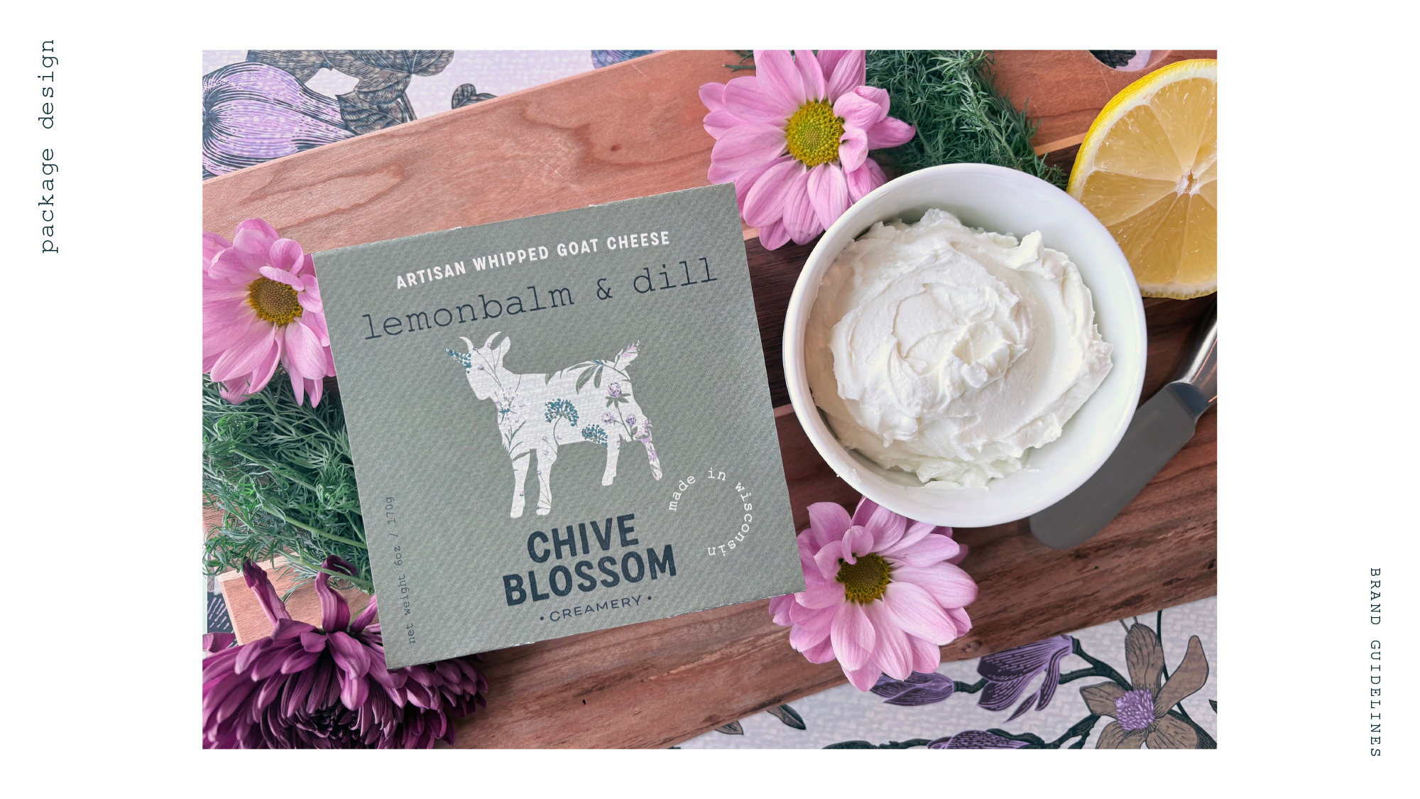
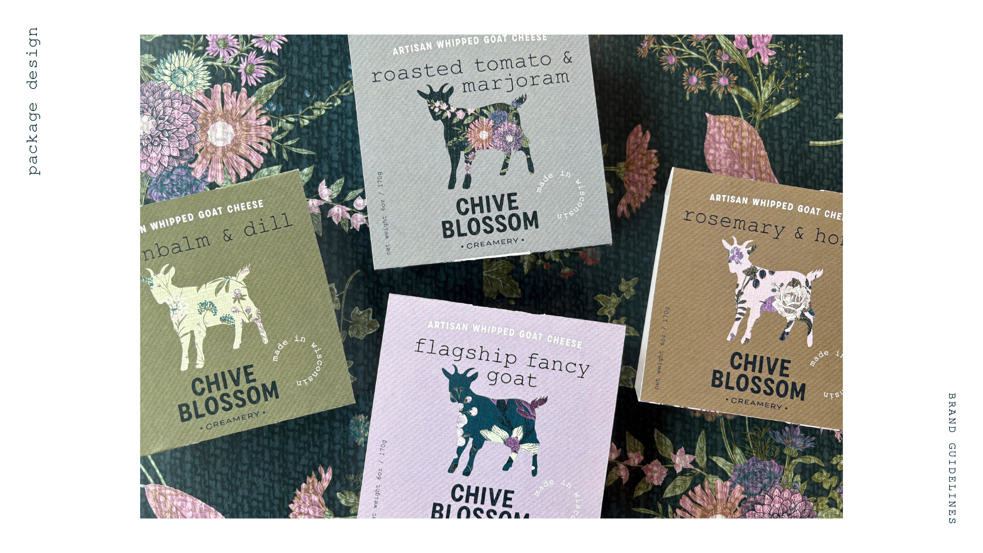
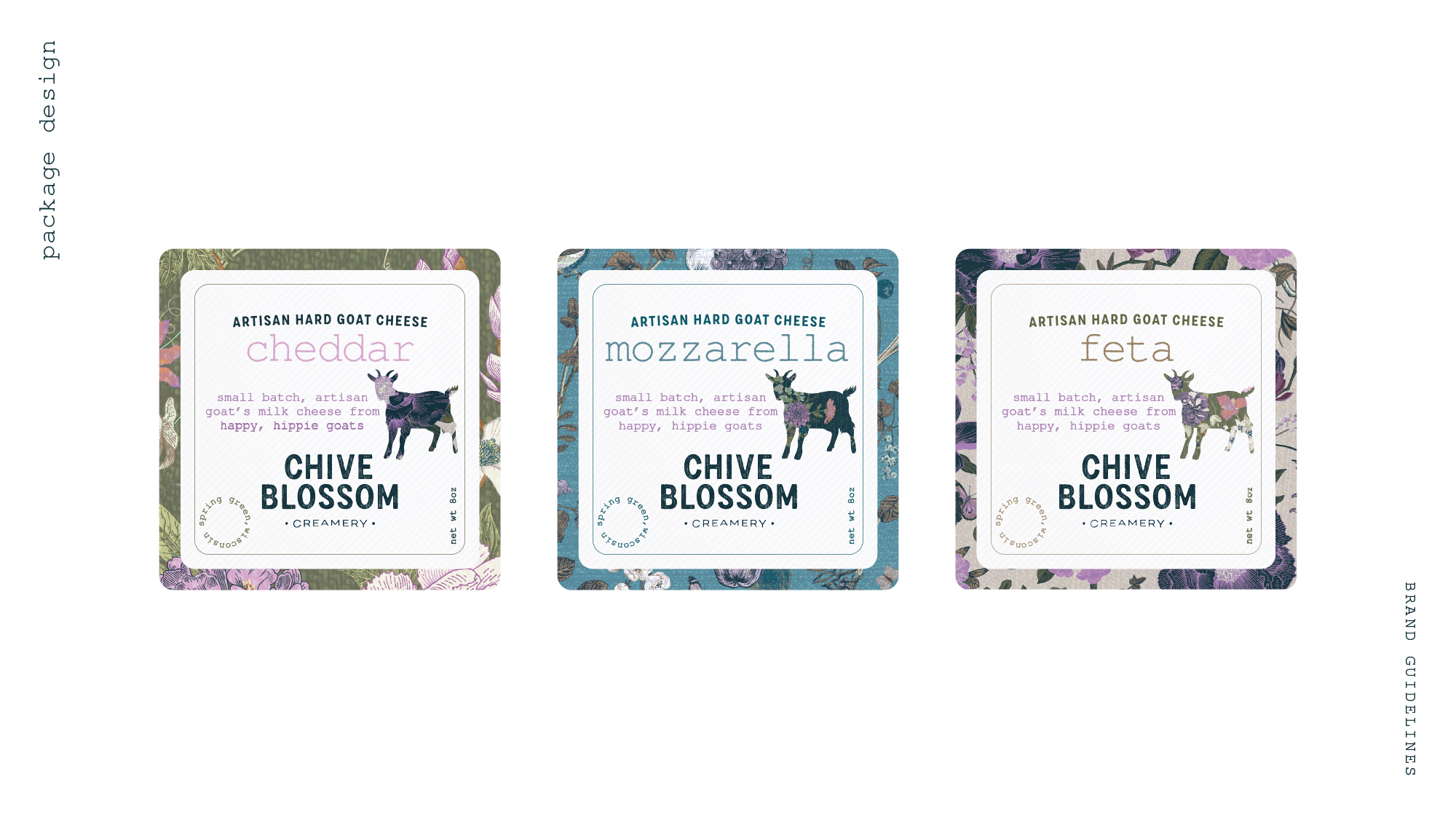
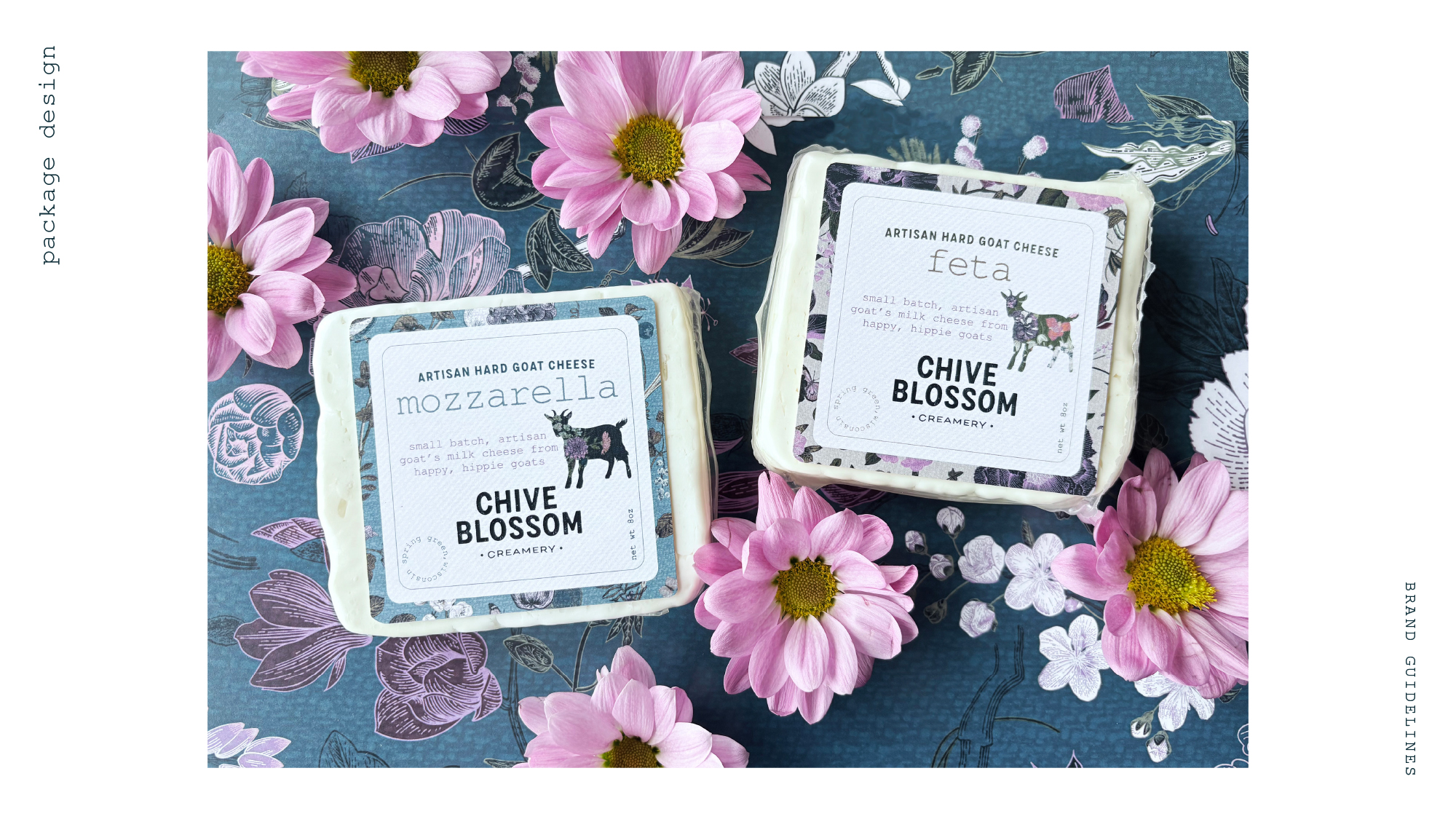
package design
original package designs were updated with the new, more cohesive color palette and illustrations, and expanded to include a secondary product line label-style design.
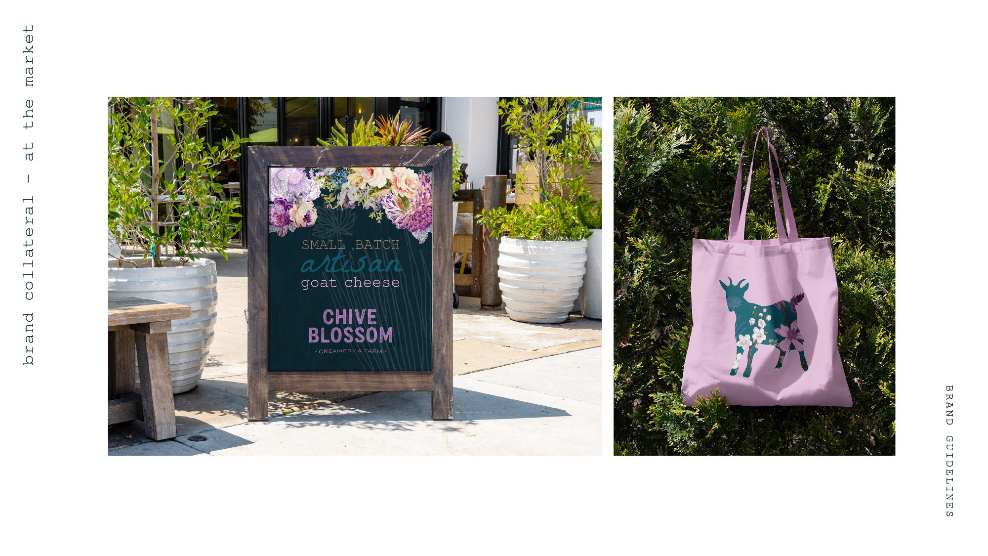
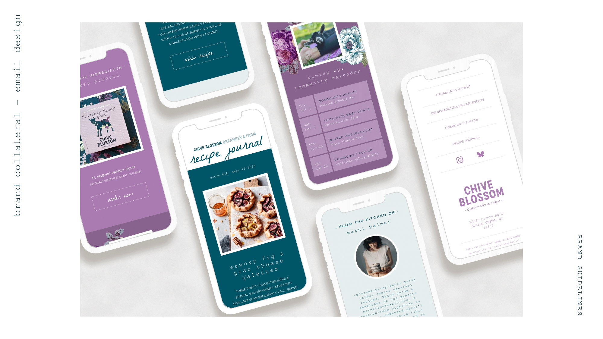
design collateral
finally the brand guidelines include a few application examples that would support an artisan business like this - an environmental signage, merchandise and importantly - a marketing email design mockup to round out the guidelines document for this client.